Eclipse Setup
Eclipse is intended to be a 'dark mode' website as per the demo site: https://admin.cchwebmanager.com/preview/13e9d6a5. However, it can be made as a 'light site' if the customer wants it to be. A 'light' example can be seen here.
IMPORTANT: When building in 'dark mode' make sure our shared content widgets settings match the site accordingly. Set the background and font colours to match the site.
Site CSS
/* GLOBAL SITE CSS - ADD CSS TO AFFECT THE WHOLE SITE */
@media screen and (min-width:1200px) {
.rows-1200 .dmRespDesignRow,
.rows-1200 .dmRespRow:not(.fullBleedMode) .dmRespColsWrapper { max-width:1500px; }
}
*#dm div.dmNewParagraph a,
*#dm div.dmCustomHtml a,
*#dm div.dmBlockElement a {
text-decoration:none !important;
font-weight:700 !important;
-webkit-transition:color 0.4s ease-in !important;
-o-transition:color 0.4s ease-in !important;
outline:0 !important;
}
*#dm div.dmCustomHtml a:hover,
*#dm div.dmNewParagraph a:hover,
*#dm div.dmBlockElement a:hover {
color:#ffffff !important;
text-decoration:none !important;
font-weight:700 !important;
}
/* BLOG */
#dm [list-layout=layout4][text-box-padding=true] .postArticle .postText {
padding: 30px 30px 0 30px !important;
}
#dm [blog-posts-feature-flag=true][text-box-padding=true]:not([list-layout=list_slider]) .postTextContainer .readMore {
padding: 15px 30px 30px 30px !important;
}
- Add the 'Eclipse Home' section onto the homepage.
- If using a dark colour for the site's background make sure that it is applied under the 'Default Background' setting and
not
under the 'Background per page' setting.
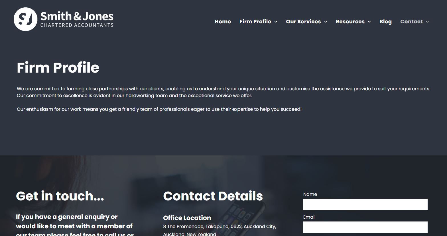
Header
- Set the header to be a shrinking header.
- Add a background colour under the 'Shrinking Header' settings so that the header changes to a solid colour when the page starts to scroll.
- For the homepage, set the header to 'Overlap first row on this page' in the header settings. Note: This setting only needs to be applied to the homepage. The header should not have a background so that it is transparent and the image header is visible behind it.
Image Header
- The images are added as background images to the image header row through the Image Header row's settings.
- The icons are anchor links that jump to the related features on the homepage. Make sure these are linked.
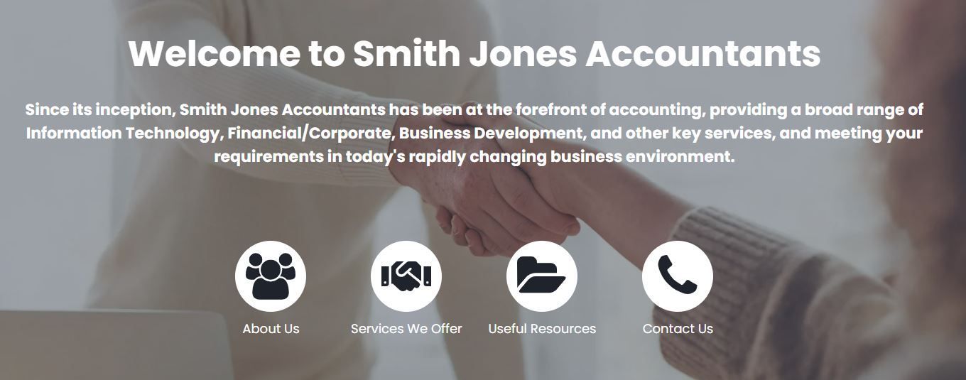
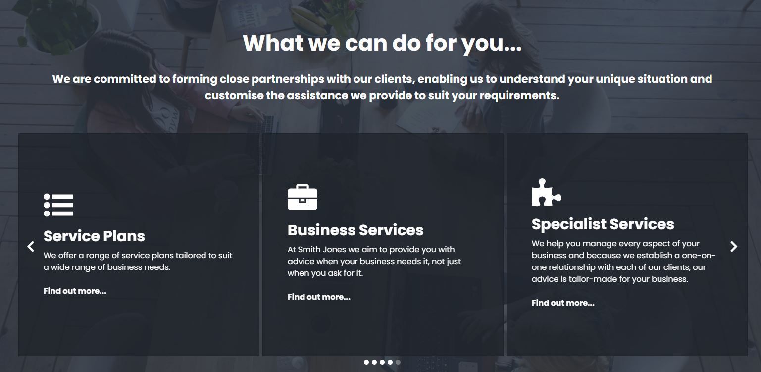
Homepage Features
Each homepage feature row is set with an anchor which is linked to from the icons in the image header.
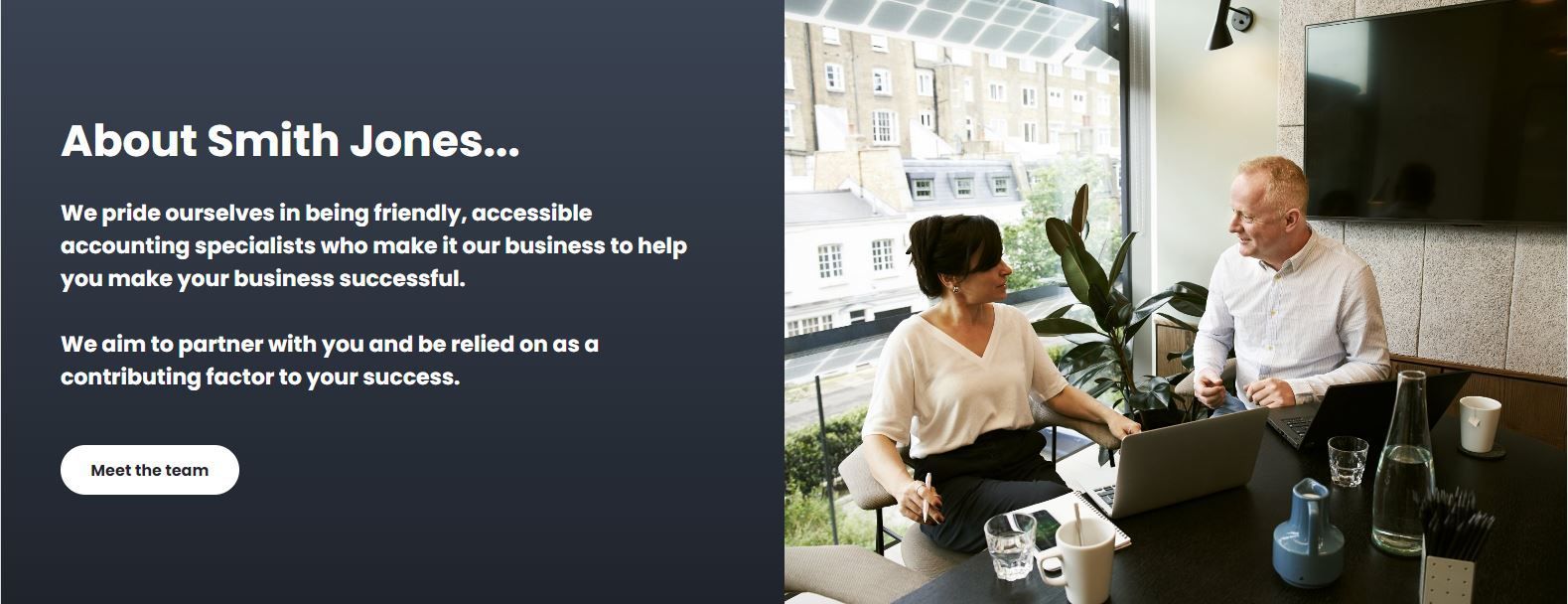
About Us feature
The row is split into two columns. The right hand column uses a background image set in the column settings.
Services Feature
The feature uses the 'Panel Slider widget' to display the services content.
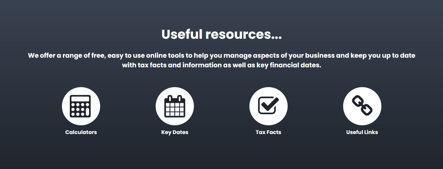
Resources Feature
The resource icons use the Icon / Text / Link widget.
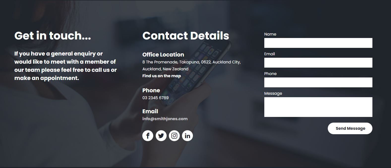
Contact Feature
- Move this row into the footer.
- Remove the spacing from the top of the footer so the top of this feature sits flush with the bottom of the Resources feature.
- Note:
There's a empty row above the contact feature row. This contains the 'contact' anchor tag. This row should
not
be added to the footer.
Footer
If the customer has partner logos to display split the footer into two columns and add the partner logos using the Partners Logos Layout widget in the right column.
Internal Pages
If the customer's logo has a solid colour background or cannot be reversed to white or a light colour then feel free to give the header a background colour to best suit the logo.
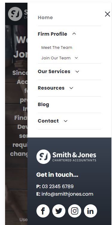
Mobile / Tablet View
Theme
Set H1 font size to 32, H2 to 28 and H3 to 20.
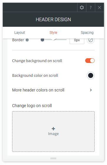
Mobile / Tablet Header
If the site is using a transparent header set 'Change background on scroll' toggle to on and set the 'background on scroll' to be a solid colour.
Mobile / Tablet Menu
Below is the default mobile / tablet menu for the Eclipse demo site. This layout can be used by default or altered to suit the customer's site design.